
This piece is inspired by research that Cliff Asness started years ago and continued since then. The methodology and calculations are original to the article.
A lot of value-oriented strategies have lagged the market for years. It is reflected in value ETFs. The SPDR Portfolio S&P 500 Value ETF (SPYV) shows a total return of about 253% since 1/1/2009 (12.30% annualized) vs. about 326% for SPY (14.26% annualized). The next chart shows the evolution of an investment of $100 in both products starting in January 2009.

Some analysts say “Value” as an investing style has been lagging for more than a decade. Personally, I think Value has underperformed the broad market since 2014, and the next chart shows why. The blue line plots the equity value of a market-neutral long-short portfolio containing half of all S&P 500 stocks in equal weight for almost 21 years, rebalanced every four weeks. The long side has the 125 cheapest stocks, the short side contains the 125 most expensive stocks.
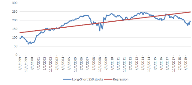
To rank stocks on value, I have ranked them separately on 4 ratios: price/earnings, price/book, price/sales and price/free cash flow. Then I have listed stocks with the 125 best and 125 worst rank sums. As two or more stocks may get the same rank sum, I have done a final ranking on the price/book ratio to select the 125 cheapest and 125 most expensive stocks. Ranks are recalculated every four weeks, resulting in a hypothetical portfolio giving the equity curve above. This is neither a backtest nor a recommended strategy. It is a study for educational purposes. The highest equity value was reached in October 2013, which justifies my claim that Value has worked backward since 2014. The orange line is the linear regression of the equity curve. To put it simple, it plots the average outperformance of Value on 21 years.
The next chart plots the difference between the previous equity curve and its regression line.
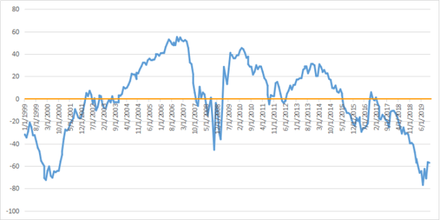
It makes the series looks stationary, at least on these 21 years. In reality, it has no reason to be stationary: the excess return of Value (and the equation of the regression line) would be different on a longer interval. However, this chart gives a pretty good idea of Value cycles in the last two decades. We can consider it an indicator about the “Value of Value”.
According to this chart, Value looks cheaper now than after the 2008 meltdown. It is cheaper relatively to the most expensive part of the market, but the market as a whole is obviously much more expensive.
This chart is likely to revert to the mean at some point. Mean reversion could give quantitative targets and probabilities if the mean and the standard deviation were constants. Once again, they have no reason to be so. The randomness of markets has little to do with the structured randomness of a casino game or quantum physics. Here, mean reversion is more a pseudo-science, common-sense idea that can’t help make a quantified, timely prediction. Anyway, from a long-term perspective, value stocks show a strong anomaly with a positive expected excess return. Large cap value stocks as a group have not looked so cheap relative to expensive stocks for almost 20 years.
Most of my stock holdings are based on quantitative value models. However, value is a bad timing indicator. Quantitative Risk & Value (QRV) provides you with a more realistic quantitative approach, for a world of probabilities instead of just risk on/risk off. It includes a systemic risk indicator and strategies based on it. Get started with a two-week free trial and see how QRV can improve your investing decisions.
Disclosure: I am/we are long SPY. I wrote this article myself, and it expresses my own opinions. I am not receiving compensation for it (other than from Seeking Alpha). I have no business relationship with any company whose stock is mentioned in this article.


